
Ultimate Brochure Design Guide
Create Marketing Brochures That Impress People Forever.
The brochure is still one of the most important ways for businesses of any size to market themselves and will continue as one of the most important marketing tools. An effective brochure will provide a way for you to connect with your audience as well as displaying your products or services to them’d assist in convincing potential customers to take action. As brochures can be distributed through multiple outlets (trade shows, direct mailings, meetings), this type of marketing tool allows you to have a physical method to educate the public on your company and/or product.
To design a visually appealing brochure that produces results, you require more than stunning illustrations. A detailed plan, creative and valuable content, and a professionally produced brochure will help you accomplish your objective. The following sections jointly explain the critical aspects of good brochure designing with some practical recommendations which will make your business look unique among others.
The Importance of Brochure Design
A brochure is the representation of your business brand. Additionally, it conveys a brand’s image through professionalism, values, and detail orientation. The appearance of a brochure that is either out-dated or poorly designed will likely turn away potential customers. On the other hand, having a brochure that is well designed and aesthetically pleasing will give the customer a sense of confidence and trust in the business.
A well-designed brochure can have the following effects;
- Increases brand awareness
- Clearly conveys product and service information.
- Drives leads and inquiries to the business.
- Supports in sales presentation processes
- Enhances overall customer confidence.
Quality brochure design is an investment to produce long-term marketing benefits.
Begin with a clear objective
The first step is to identify the objective of the brochure prior to even opening the design software.
Ask yourself:
- Are you currently marketing a particular product?
- Are you presenting your organization?
- Are you advertising a certain event?
- Are you trying to find new leads (potential customers)?
- Are you educating your customers on how to use your products?
A well-defined objective will be one of the most important factors when determining content, layout and calls to action.
Understand Who You Are Selling To
The most effective brochures are built around a specific audience profile.
Think about these factors:
- industry
- age group
- business needs
- purchasing habits
- pain points
A brochure made to appeal to corporate executives will look completely different than one created for families. A brochure for an executive audience will probably be designed in a more straightforward and professional manner, whereas one made for families will most likely feature bright colors and attractive/friendly looking images.
Pick the Correct Brochure Format.
You can find a variety of options when it comes to finding the right style of brochure that will fit your needs for content.
Popular options include the following:
Bi-Fold Brochure
This type consists of four panels. It is best used for company profiles or as an overview of what you offer in terms of services.
Tri-Fold Brochure
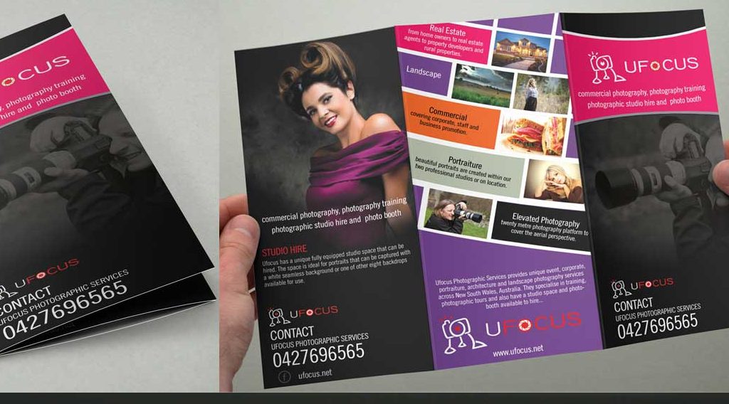
This is probably the most popular format of brochure that is used today. It consists of six panels that will allow you to organize all your content into distinct and organized sections.
Z-Fold Brochure
It is great for any sort of step-by-step guide or if you are doing a comparison of different products.
Gate Fold Brochure
This provides a more high-end type of presentation and is often used by luxury brands or when launching new products.
Choose the brochure format that supports your message, and meets the expectations of your target audience.
Design Covers that Work Great!
The front of your brochure is the first thing anyone will see about you. It, therefore, needs to instantly express a benefit to them, as well as encourage them to open it.
A good cover will:
- create an immediate impression,
- contain high quality images,
- include a corporate logo,
- uses minimal text, and
- is clearly branded.
A good cover does NOT overwhelm the reader with tons and tons of information!
Organize Your Material So It Can Be Read.
Most of your potential customers will look at your brochure for just a few seconds. They’ll just look to find out if it’s interesting to them, so you need to find a way to keep their attention once they’ve picked it up.
Make your brochure easier to read by:
- Including short, direct headlines,
- Breaking up text into smaller “paragraphs”,
- Using bullet points to convey multiple related ideas,
- Using icons to support certain things that they’re looking for, or
- including some white space to provide for rest for their eyes.
- Once you have created logical flow of information, consumers can better determine your message.
Use the Best Pictures Available!
Pictures are an important aspect of the ultimate success of your brochure.
All the pictures you put in your brochure should be:
- Sequential pictures that together formulate an effective graphic design that will successfully convey the appropriate message to the end-users as quickly as possible without the need of much effort.
- High quality images at least 300dpi or higher.
- Professional photography
Consistent Appearance;
Genuine Pictures Whenever Possible
Do not utilize images that appear pixelated or generic as it detracts from the credibility of your site.
It is essential to maintain brand consistency;
in terms of design; your brochure should align with your brand as a whole.
Some examples of this include:
- Logo location
- Color scheme
- typography
- Graphic design style(s)
- Message style.
A consistent brand helps customers identify your company and can help them remember you in the future.
Typography;
When deciding which fonts to use for both print and online materials, select those which are readable. There are several guidelines and suggestions regarding typography such as:
- Use no more than two to three typefaces.
- Use larger font sizes for headers.
- Maintain adequate spacing.
- Do not use decorative typestyles in body text.
- The readability of your type will enhance the user experience and demonstrate professionalism.
Focus on your Advantages Not Features
If you give a customer a description of your company, it’s best to explain how you help them as well.
Here are some examples:
Instead of
- 24/7 Customer Support write
- Expert Help Anytime You Want It Through Our 24/7 Support Team.
Benefit-oriented messaging establishes deeper emotional connections.
Set Forth An Explicit CTA. Brochures must motivate the prospect to do something. Examples include:
- Contact Us Today.
- Schedule your Free Consultation Now.
- Visit Our Website With This Link.
- Request a Quote.
- Scan the QR code to Learn More.
You should make your call to action clear and simple.
Finding a good balance between pictures and words.
A cluttered brochure can overwhelm your audience.
To create a balanced design, you should include:
- Documented content
- Illustrations
- Icons
- Pictures
- White areas
A neat design will be more attractive and easier for readers to digest the content.
Design for Both Print and Digital Use
Many brochures are now distributed either as PDFs on the internet or as brochures viewed on mobile phones.
While designing you must ensure that you have:
- The print quality must be set to 300dpi.
- Bleed should be set to create a good print final product.
- CMYK is the color scheme required to achieve the best possible result.
- PDF size must be compressed for sharing on the internet.
- Through creating digital-ready files, you are increasing the number of areas where you can publish your content.
Proofread Before Printing
Typos and formatting errors may damage the reputation of your brand.
Before you conclude
- Check spelling and grammar.
- Double-check the contact information
- Check Prices and Dates
- Analyse the image quality
- Verify QR Codes, Test links.
The chances of mistakes are minimised when many team members examine the brochure.
Common Mistakes in Brochure Design to Avoid
When it comes to brochures, many businesses often dilute the power of their brochures with
- Too much text on each page
- Low-resolution images
- Branding that is not uniform across all items
- Weak headlines
- No contact information at all
- Bad alignment or bad spacing
- Navigating the brochure is difficult
Final Thoughts
Although most of us think brochures are dead, if designed strategically a brochure will always remain one of the greatest marketing assets. You learn about your audience, keep the branding consistent, structure the information well and make it visually appealing.
Be it advertising a new product, explaining your company better, or helping the sales team, professional brochure design is an essential investment to achieving success for your brand. The brochure is one of the most important tools — when thoughtfully planned and composed.